Graphic Arts
I’m not sure I have an identifiable design aesthetic. Some of what I do is inspired, some miscellaneous, some serve a client, a brand, or work as a user interface or user experience element. Most of my work is a playful combination of photography, graphic design and vector graphics. All of it is fun to create.
Beer Labels
My wife and I have been brewing beer since 1995. Our first labels were created with a now extinct application called SuperPaint before moving on to Photoshop. The question is always – which will turn out better the label or the actual beer!
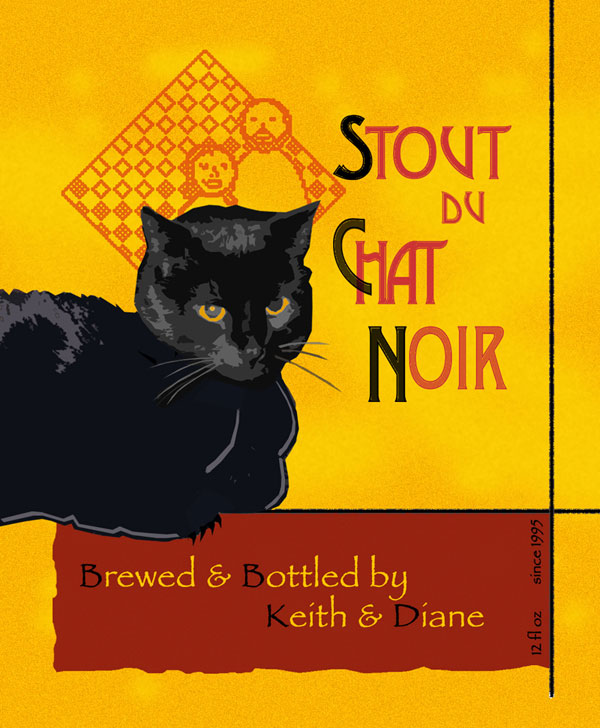
Stout du Chat Noir
Description.
Based on the famous and often reproduced / reimagined poster by Théophile Steinlen my label uses a photograph of our cat, Tupper. He wouldn’t let me pose him upright and looking regal, so I used his normal, relaxed, mellow pose! I applied some texture and red-yellow coloring to the background and used our K&D logo behind Tupper’s head to mirror the poster. I probably could have applied a little more graphic design to Tupper. As is I used a small amount of posterize filter and added a little outlining.
The “K&D” logo appears on all our beer labels. I created it based on an old photograph of Daine and I in front of one of Diane’s quilts.
Information.
- Title : Stout du Chat Noir
- Style : Stout
- Main Font : Desdemona
- Medium : Graphic Design, Photography, Photoshop

