Graphic Arts
I’m not sure I have an identifiable design aesthetic. Some of what I do is inspired, some miscellaneous, some serve a client, a brand, or work as a user interface or user experience element. Most of my work is a playful combination of photography, graphic design and vector graphics. All of it is fun to create.
App UI Design
App design is challenging. Everytime a new smartphone or tablet screensize is introduced it affects how the app’s graphics and user interface is rendered. This is tricky, annoying, frustrating, but also rewarding when you get it right. Below is a small sample of my work, for more detail see the One Bad Ant web site.
ADK46erNow UI Graphics

Description.
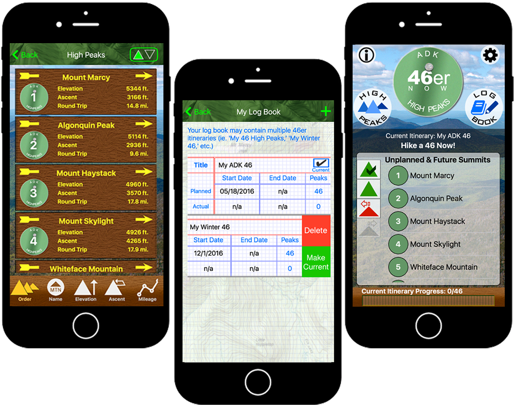
This is one of the best looking apps I’ve created. The photographs and the background topo maps work really well. The user interface element mirror the trail markers and signs hikers find while on the Adirondack trails.
Many apps have moved away from using real world design elements (Skeuomorphic Design), but it really works for this app. Using a trail marker logo on the home screen that turns into a compass when tapped or viewing the list of high peaks as a series of trail markers keeps the hiker connected to her hike. My desire here was not only to create a functional app but one that was also immersive. I wanted a design that hikers would want to use and one they would connect with.
That being said there is a bit of a hybrid design here. The titlebar, while it has a background graphic, is basically flat. The titlebar buttons are simple text or characters and the home screen’s utility features like the “info” button or the “settings” button are flat and utilitarian. The “High Peaks” and “Log Book” buttons on the home screen could not easily be turned into trail markers without really torturing them so they are also flat buttons.
Information.
- Title : ADK46erNow
- Documentation : OBA Web Site
- Android : Google Play Store
- iOS : App Store
