Graphic Arts
I’m not sure I have an identifiable design aesthetic. Some of what I do is inspired, some miscellaneous, some serve a client, a brand, or work as a user interface or user experience element. Most of my work is a playful combination of photography, graphic design and vector graphics. All of it is fun to create.
App UI Design
App design is challenging. Everytime a new smartphone or tablet screensize is introduced it affects how the app’s graphics and user interface is rendered. This is tricky, annoying, frustrating, but also rewarding when you get it right. Below is a small sample of my work, for more detail see the One Bad Ant web site.
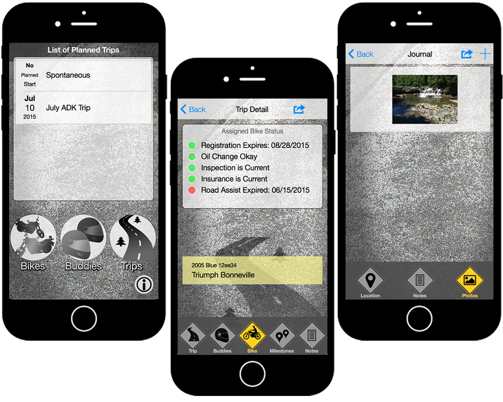
Moto Trip Now UI Graphics

Description.
This is the cleanest, flatest design of my apps. A lot of texture in the background and a lot of opacity applied to most elements, but no shadowing or 3D effects. I like the monochromatic nature of this app. Any use of color really re-enforces the user experience. The yellow tab bar buttons showing where you are in the app, the yellow highlight on a list selection and even the green, yellow, and red status indicators all stand out helping the user focus on what’s important.
This minimalist design also hides a lot of complexity in this app, which includes the ability to plan a trip, record milestones, get weather forecasts, call your roadside service for help (which unfortunately I’ve needed), and share your trip info and photos via social media outlets.
Information.
- Title : Moto Trip Now
- Documentation : OBA Web Site
- Android : Google Play
- iOS : App Store
